SHC
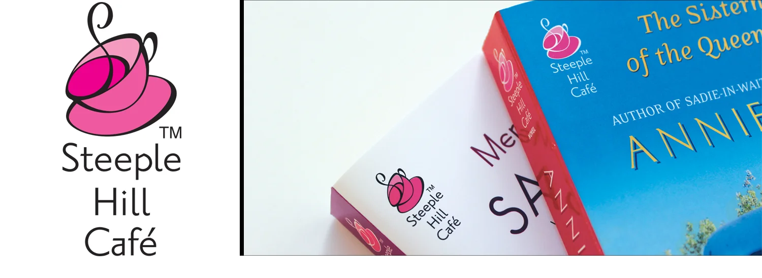
CASE STUDY | Logo designed as a sub-imprint of Steeple Hill books. Steeple Hill Café was established to target the 18-35 year contemporary Christian women’s market. The lineup of books had “cleaner” storylines than other similarly branded books in the chick-lit genre such as Red Dress Ink.
The logo, a tilted coffee mug and saucer was designed to represent the whimsical stories and the not-so-perfect females striving to get their lives on the right path. As Art Director on this imprint, I was responsible for the development and for following the packaging visual strategy.
The hand-lettered tagline, LIFE, FAITH AND GETTING IT RIGHT was created as an additional reinforcement to the brand and stories.
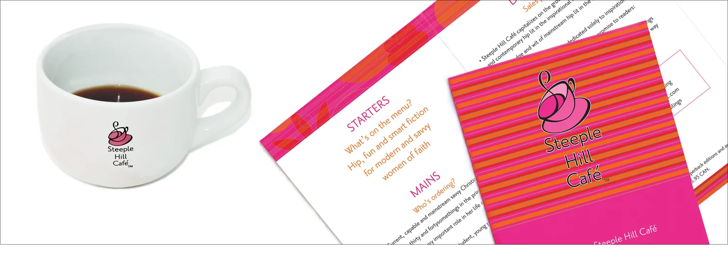
Promotional brochure was designed for the industry launch media kit. The strategy highlighted the clever copy in a menu-like format. A large mug and Starbucks pre-paid card accompanied the brochure and a sample book.
STEEPLE HILL CAFÉ • SCOPE OF WORK | Hand-lettering, Logo, Brochure, Book Cover Art Direction and Design


